CONTEXTS
Game - SSBU: World of Light
World of Light is a single-player mode where players explore the map and try to save fighters from the dark realms, and during your journey, you can unlock spirits to assist you along your adventure.
Challenges -
Analyze the WoL mode flow and discover which feature can be improved
Define player experience goals and project design goals
Create a new QoL and improvement proposal for the mode
Role - UX Designer
Project Length - 2 weeks
Skills - Wireframing | Prototyping
Tools - Figma
This is a project that I have worked on from attending an advanced UX course.
DESIGN PREVIEW


WORK PROCESS
After I have finished my experience goals for my case study, I have written down the scopes from the most essential (bronze), good to have(silver) to the most ideal (gold).
Each of them represents the feature I will be working on to create a better gameplay flow.
During this design, I will be focusing on two important aspects in the mode: Icon + Spirit, Presentation + In-game info.
-
In the map itself, there are many activities in this map such as battles, shops, gyms, etc, but the game never tells players which icon represents what. Another example is spirits, where you take several spirits of your choice to the battlefield, where players would get unique benefits from each spirit, but you can only view the benefit from the spirit selector screen.
-
Since each battle has its own unique condition and rulesets, it is hard to keep up what is going on at all times. When you selected the battle you wanted in the map, you can only view the condition/spirit in the pre-fight lobby and the loading screen. Once you are in the game, there will be some notifications to tell you when some specific event is triggered, but as players, you can't check what condition/rulesets you are playing with/against, esp when one game takes around 2-3 minutes. It is hard to remember every unique rulesets/conditions.
FLOW CHARTS
This flow chart shows what is being added as new and which screen is being altered. The idea is to see how the spirit info

FINAL DESIGN
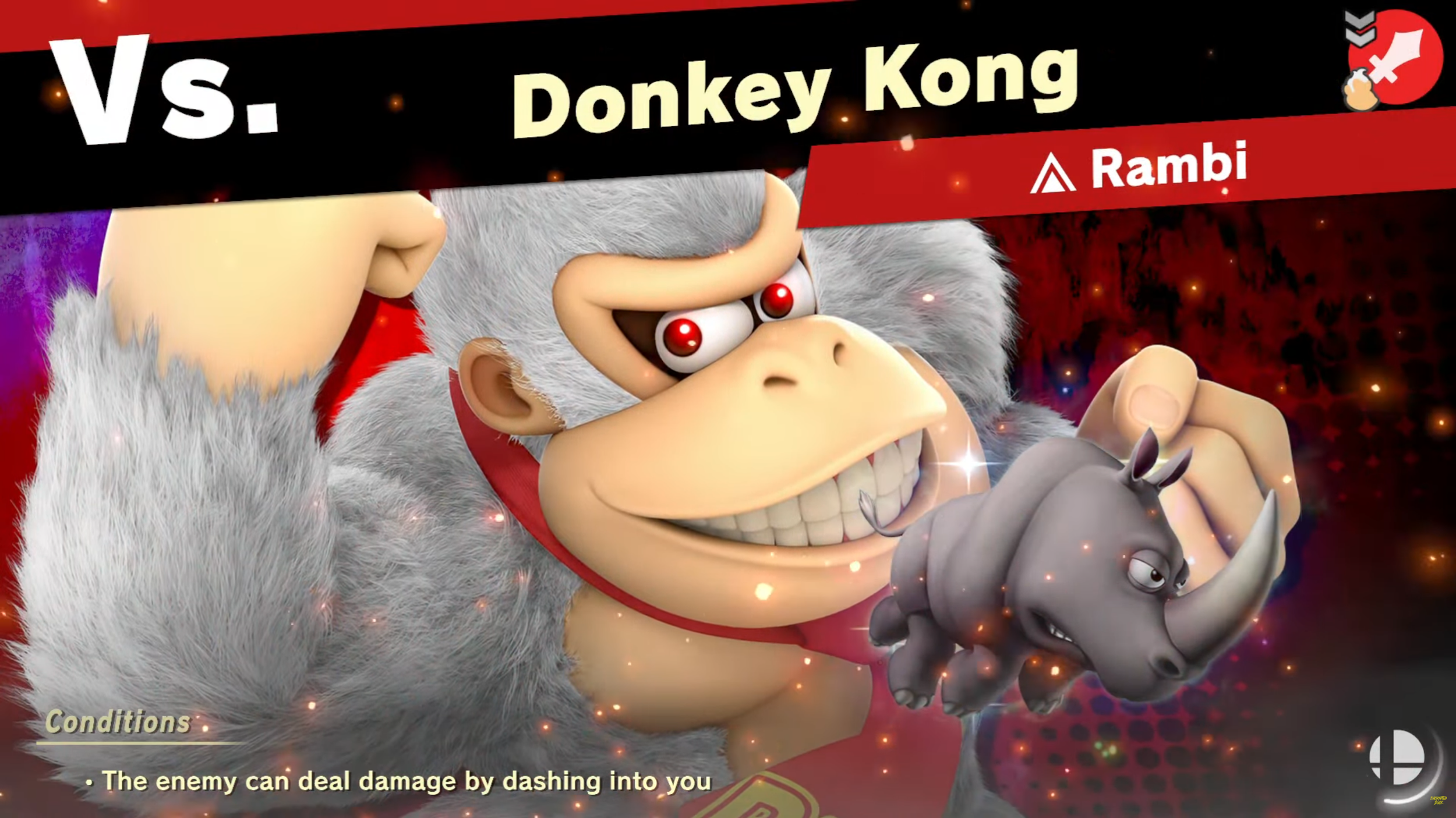
Loading Screen
Added a player side to the loading screen for an easier comparison with the enemy team, as well as mimicking the versus screen to the other modes, such as brawl.
Added a color background to represent their spirit type color so players understand if they are encountering their enemy during the loading screen.
combined game condition and team spirit into one section, where players and flip the info back and forward for maximum screen save.
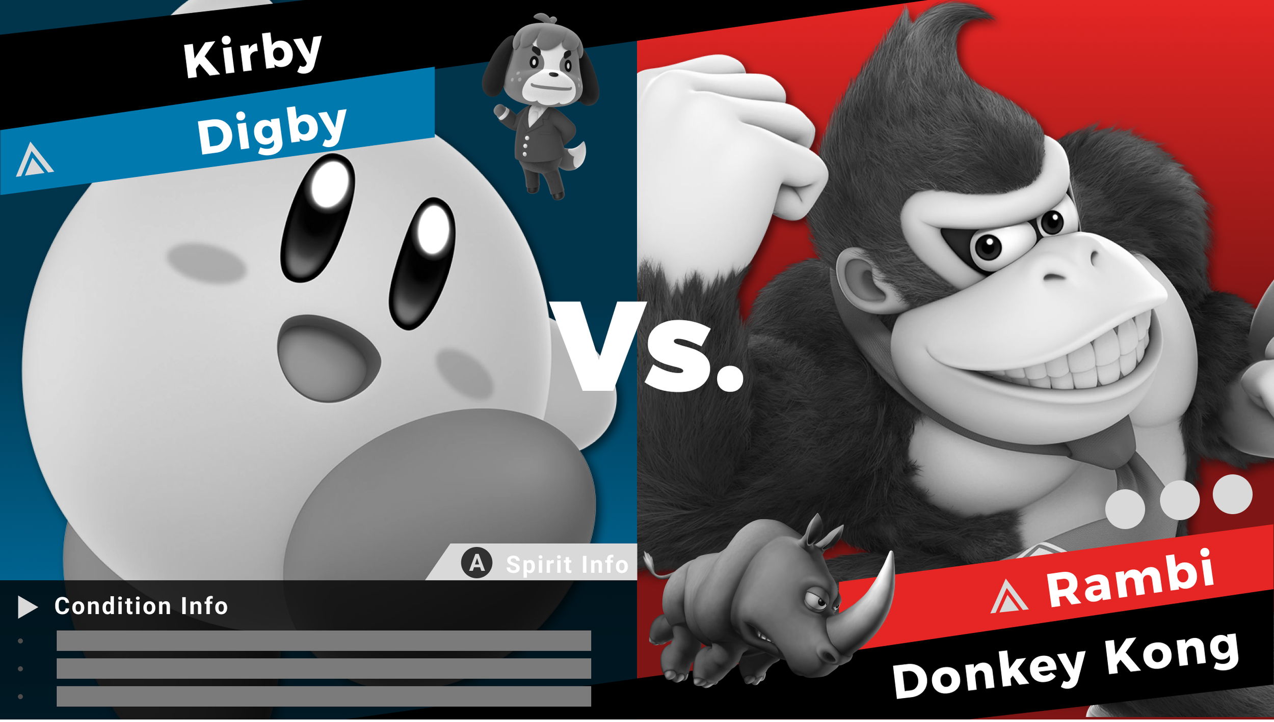
Orginial Screen

Rework Design
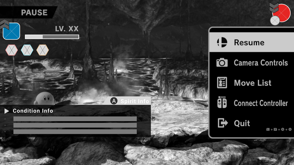
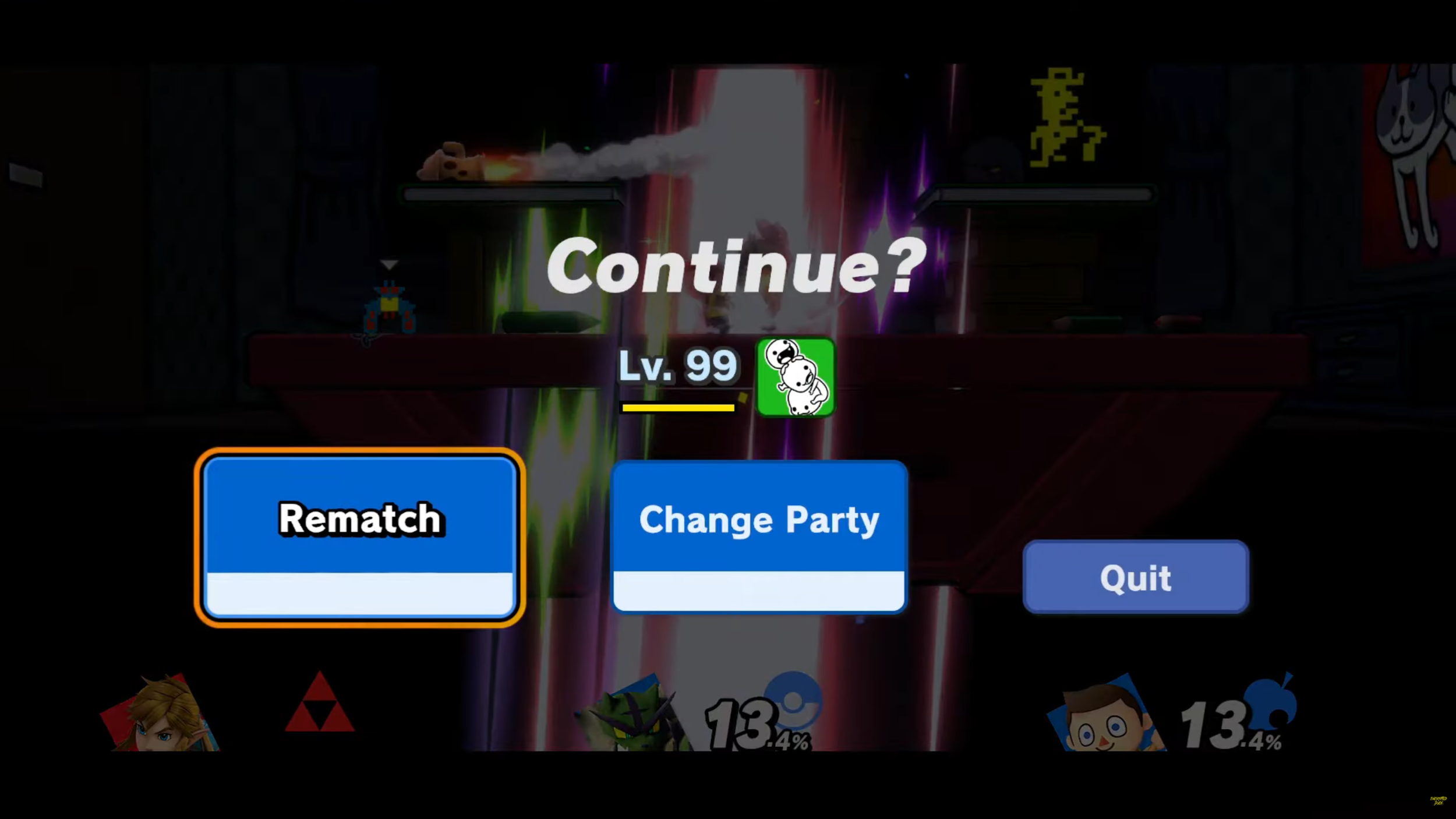
In-game rematch/pause screen
Added player team info to the screen, so players can find out if they have to change party out without clicking into "change party"
Combined game condition and team spirit into one section, where players and flip the info back and forward for maximum screen save.
Rearranged the UI for rematch, change party, and quit button to match with the pause screen.
Orginial Screen

Orginial Screen
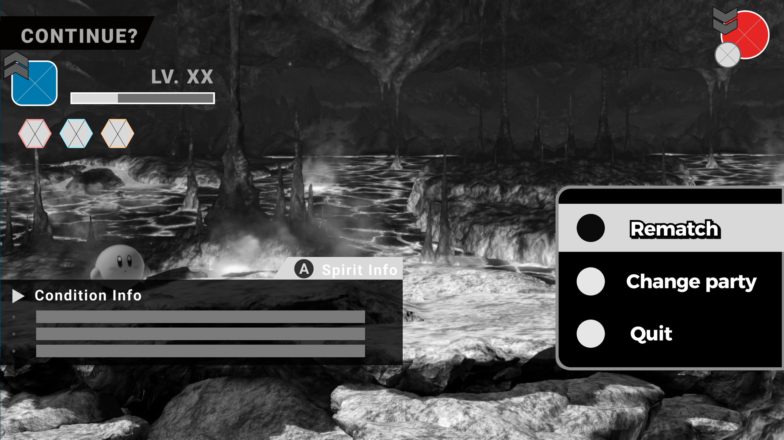
Rework Design

Rework Design
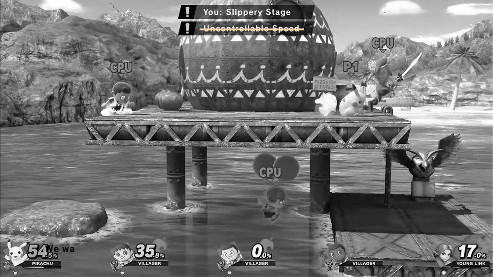
In-game screen
The condition will be crossed out if a spirit(s) has an ability that counters the game condition so players will understand this condition will no longer apply to them.

Orginial Screen

Rework Design
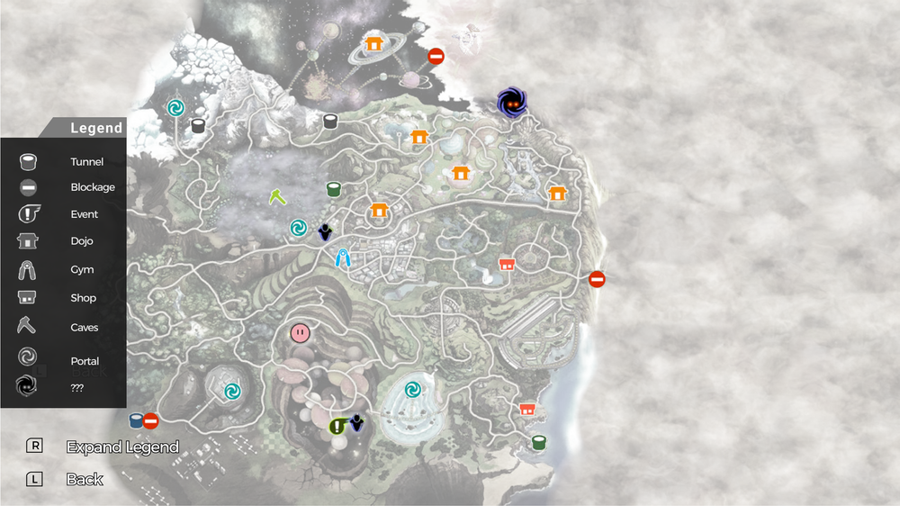
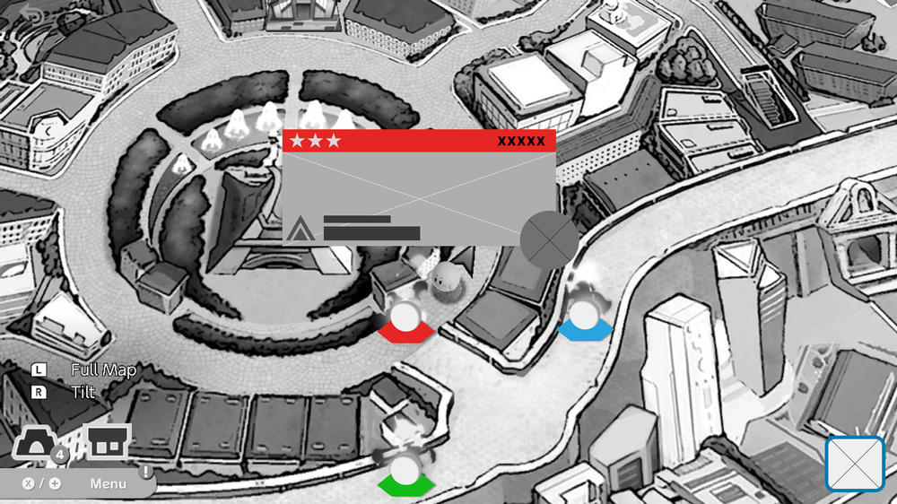
Macro map screen
Added a legend that players can expand and condense the legends therefore the icons can be read a bit clearer for the players.
Since there are many colors for the map itself, the map will now become lighter when players enter the marco screen, so the icons + legends will be easier to read.
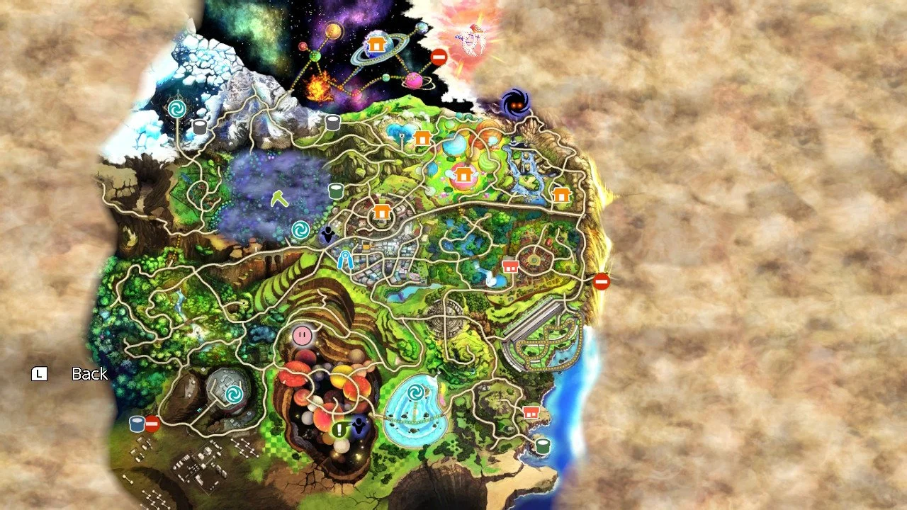
Orginial Screen
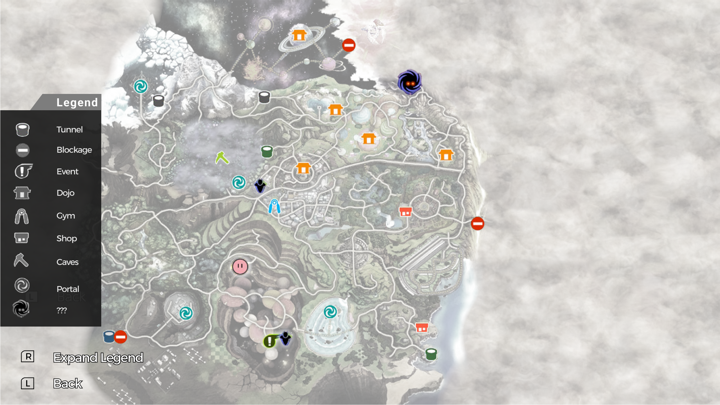
Rework Design
Micro map screen
added a color-coded system for spirit battles for players to gauge each battle, as well as adding additional info like enemy team power, enlarging the spirit type (so players know which spirit they will gain after each match), and enlarging the enemy fighter icon.
added player battle info in the corner of the micro map, so players can compare numbers + color against each battle.
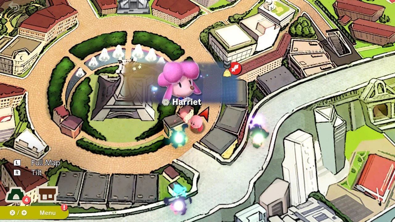
Orginial Screen

Rework Design
CONCLUSION
Outcomes
Created a detailed game flow chart to understand what is needed for the design
Discovered key issues in the project and created an executable design plan
Improved the screens for their readability and hierarchy by merging info and adding needed player information
Post-Portem
Set clear player expectations for the design to follow through
Understand what the key issues are to easily create design solutions
All design making are all coming from the players’ expectations and perspectives